HEAP
02/
2021
Methods used in this UI/UX project:
- User Interview
- User Persona
- HMW...
- Crazy 8’s
- User Stories
- Card Sorting
- Site Map
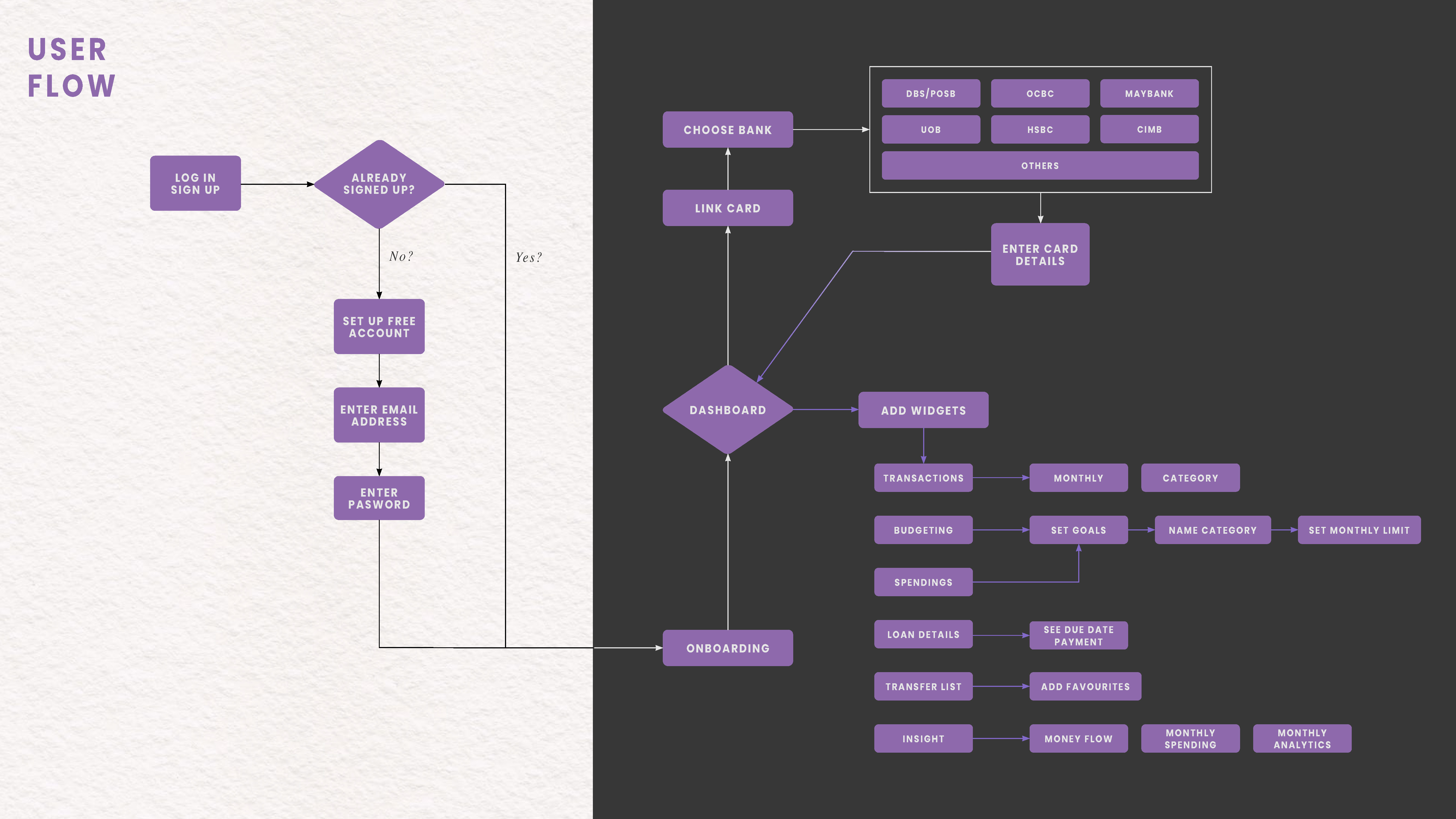
- User Flow
- User Testing
Digital Banking have been improved and evolved throughout the years. Where the mobile banking application plays a bigger part in a user’s daily life, giving them convenience to perform tasks easily with no hassle.
However, some things can’t be done or seen as easy as online website and vice versa. The main difference between website and mobile is the bigger view of the bank details and the user flow. Some things can be done on mobile app but not on website and some things can be done on website banking but not on mobile.
Remember, everyone has a different mindset and habit when using the mobile banking app.
Goals:
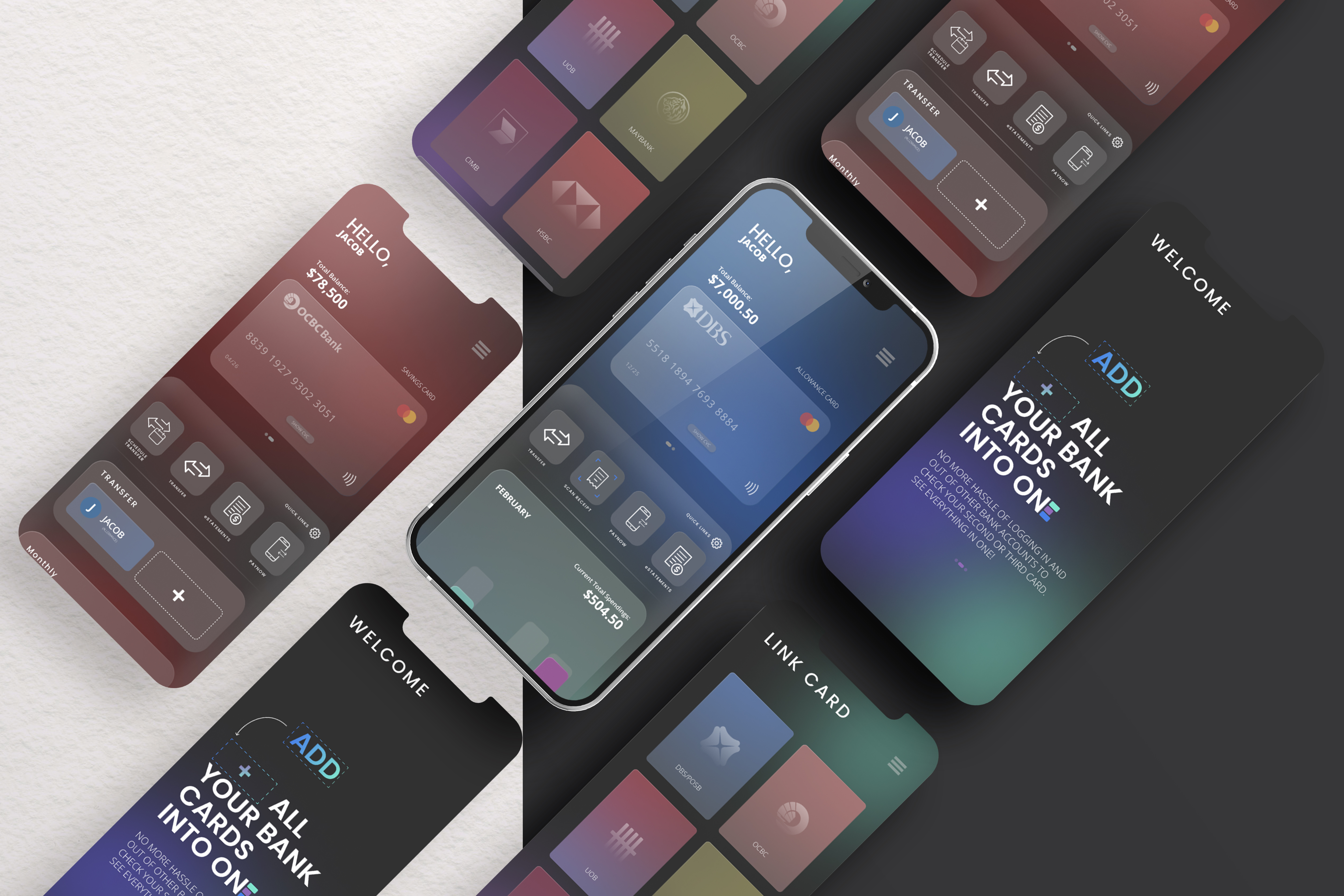
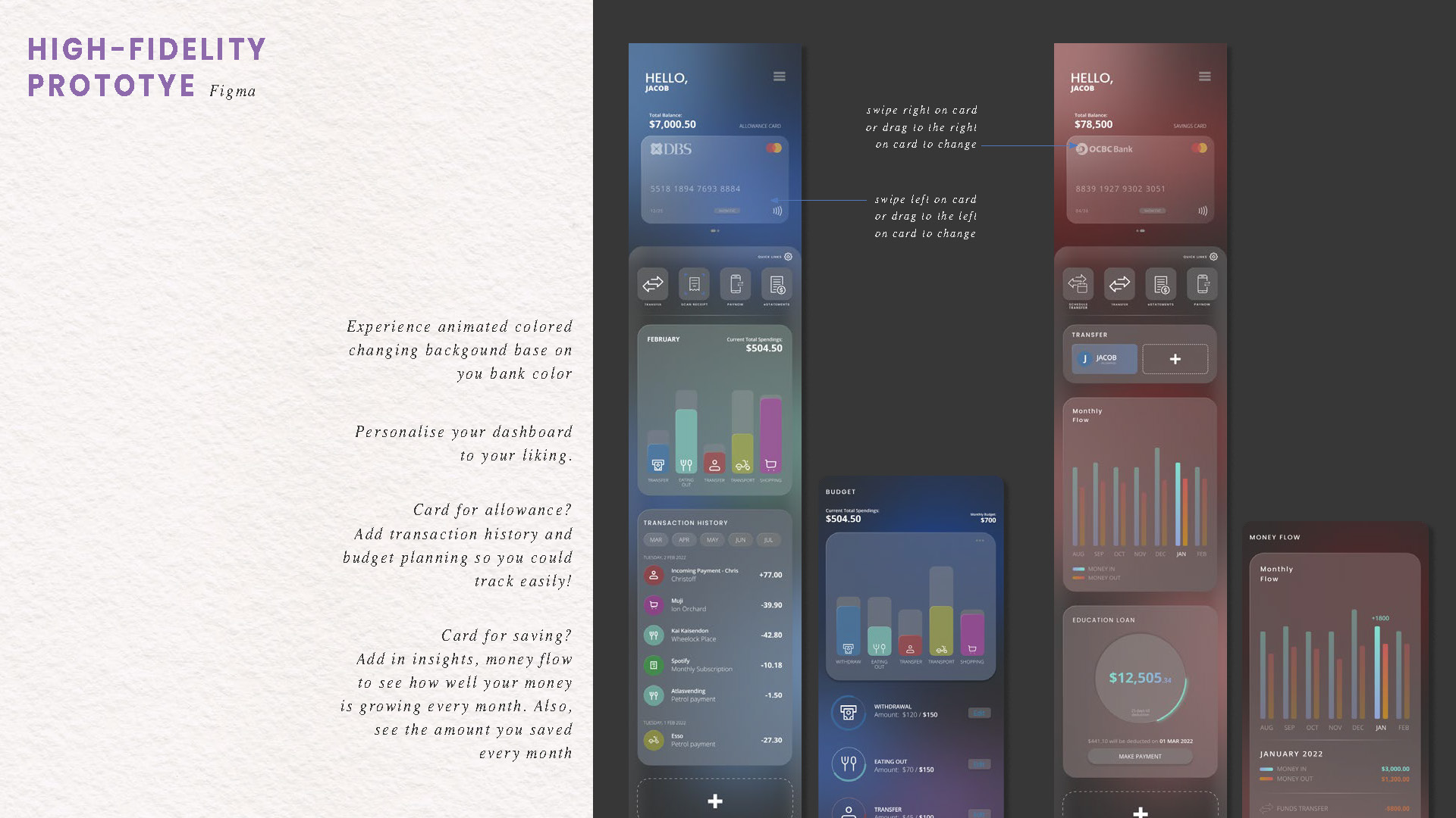
// To give the user free will to personalise their own banking accounts to their own liking and main focus.
// Creating an app with adaptability in mind, so that they could customise and personalise their own home page and also get the same view when opening the application on desktop/monitor. // Creating a new application that is compatible for both mobile and desktop which will allow those who would want to have a better view to manage their accounts and open it ontheir laptop or desktop.
Want to skip the research part? ︎︎︎
