06/
2023
Duration:
- 8 weeks
Tools:
- Figma
-
Miro
- Illustrator
Methods used:
- User Research
- User Interview
- HMW...?
- User Stories
- Card Sorting
- Sitemap
- Flowchart
- Low Fidelity Wireframes
- Mid Fidelity Prototype
- High Fidelity Prototype Design
OVERVIEW
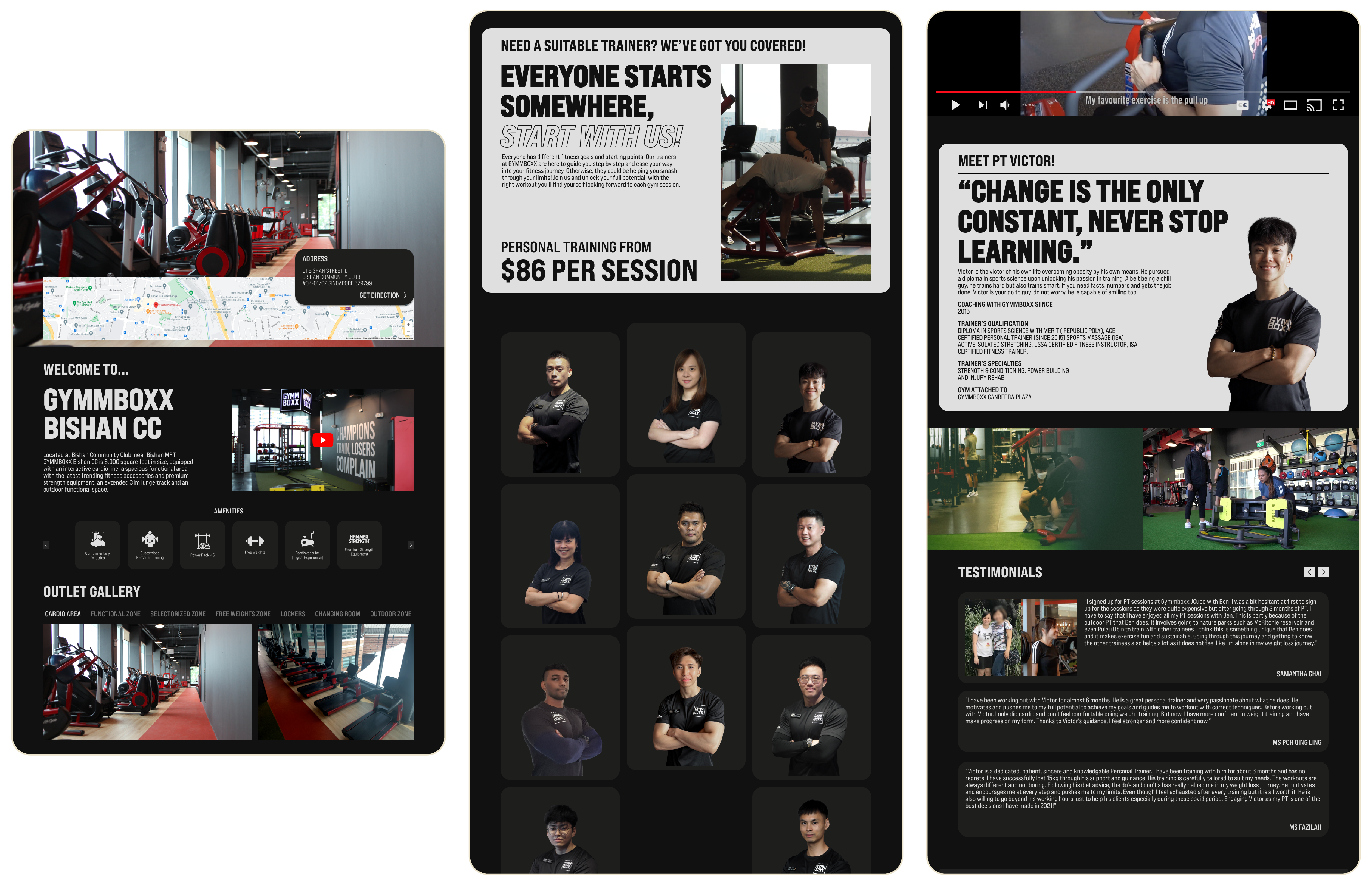
As the designer of GYMMBOXX, I noticed and decided to redesign the company's website since I thought it to be quite empty and dull. It doesn't truly demonstrate what or who GYMMBOXX is. The goal of having a website is to inform and educate our clients and members about our gym.
Where are the gyms located?
How does the gym look like in each outlet?
What equipment are there in the specific gym?
This basic questions was not really answered in the current website in a satisfying way and my aim is to create a smooth and clear journey for users to understand more of the gym.


DISCOVER
I began my project by investigating the issues that exist in websites in general, as well as the current GYMMBOXX website.
- Visitors' attention is not being captured. The majority are there to gather information. If they are not members, they are there to conduct research on the nearest gym to their home/workplace for convenience and to learn what/which is best for them. If they are a member, they are there to learn more about the gym's improvements and what it has to offer.
- A website should serve as a display and sales platform. A platform that contains all information while also attracting more clients.
- Not strategically designed for the business and its objectives. Using a templated website may result in visual and flow similarities with other gym websites.
Understanding GYMMBOXX website:
- Currently, the GYMMBOXX website does not provide the optimum flow and user experience. Although they do exhibit each outlet's interior, I believe it could have been done better and with more detail. Especially on their homepage, which lacks a pleasant atmosphere.
- GYMMBOXX website is being run under wordpress and was built with a WordPress template.
- The template was constructed without any usability testing and with minimal regard for flow because it was designed with a basic/standard/common flow. To appear similar to other common websites.
I started by interviewing GYMMBOXX ground and HQ staff to gain a sense of their aspirations and goals, as well as the challenges they faced.
- What do you think of the current website?
- What is one negative point of the website?
- Do you think you can see what GYMMBOXX is from the website?
- What is lacking in the current website?
- What are you struggling with regarding the website?
- What improvement does the website needs?
- What do you want to achieve with the website?
- How can you help your users?
- What do your user need?
- What new/important features do the website need (if any)?
- What is most important and what is not?
- Lastly, what makes a website a GOOD website?
This research encompassed:
- Understanding the user goals and needs
- Uncovering pain points with the existing user journey
DEFINE
Based on my first interviews with ground and HQ staff, I developed design challenges, goals, and suggestions to provide a more thorough emphasis on what needs to be done and altered in their present website.
Problem Statement:
Goals:
Problem Statement:
- The current design neither draws the user's attention nor gives a credible appearance. As noted in earlier presentations, there is no flow, topic, or attention.
- The current website does not accurately represent who they are. According to my research, the website does not show who they are or what makes them the gym to go to.
- The layout of the website appears to be randomly slapped together with no decent visuals. The current layout appears to be 'dead' or dull, as if it was ‘created from an excel spreadsheet’ and uploaded to WordPress.
Goals:
- To redesign the look and flow of the present GYMMBOXX website in order to make it appear more credible and gym-like.
- To design and offer GYMMBOXX a more unique appearance.
- To completely overhaul GYMMBOXX's website so that it reflects their unique personality and who they truly are.
- To make it more simple and straightforward for customers/members to navigate the website.
“TO IMPROVE USER TOUCHPOINTS AND PROVIDE A BETTER EXPERIENCE THROUGHOUT THE WEBSITE.”
Points to focus on:
- Attention.
What catches the viewer's attention?
What will help with the attention if GYMMBOXX is shown for who they truly are?
What will aid in the recruitment of new members?
What will entice customers to join GYMMBOXX?
What should be the top priority?
What should be the first thing they see when entering the website?
- Flow.
How will we improve the flow with regards to the attention part?
What will be the first thing to come to help with the attention?
How can we move users from 'oh wow' to 'WOW' to 'OMG I NEED TO GO THERE'?
How should the website's flow be designed to provide a pleasant journey?
HMW...?
- How might we get a better attention towards the website?
- How might we bring in more membership?
- How might we design the website to show that GYMMBOXX is the one to go for?
- How might we layout the homepage to give a good start to customers?
- How might we make customers feel that they could trust GYMMBOXX as the go to gym?
Based on the research data I had gathered thus far, I conducted another round of interviews with new questions. This time, I've invited GYMMBOXX members to be interviewed as well.
- What is unique about GYMMBOXX?
- What is the selling point of GYMMBOXX?
- What is the one thing about GYMMBOXX that people love?
- What do you think GYMMBOXX should market more on?
- What is one thing that made GYMMBOXX different from other GYMS?
- How are the equipments in GYMMBOXX like?
- What about the members and ground staffs?
- The environment? Ambience?
- Lastly, can you tell me what you feel about GYMMBOXX as a whole? (Give both positive and negative points)
This interview was conducted in order to gain a better understanding of what the company should focus on more in their website, what needs to be shown/marketed in order to give customers a better understanding of what GYMMBOXX is.
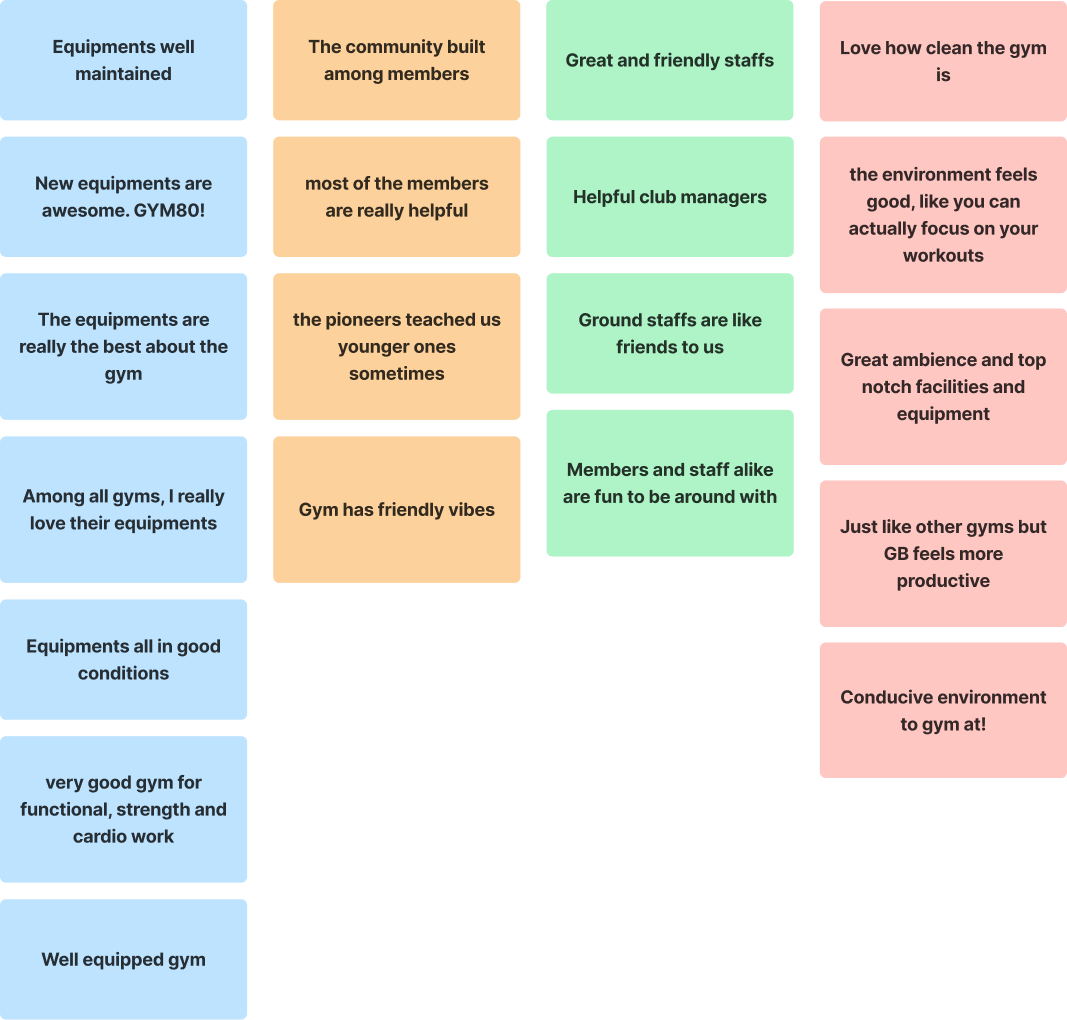
Gathered and categorised the answers received during interview:

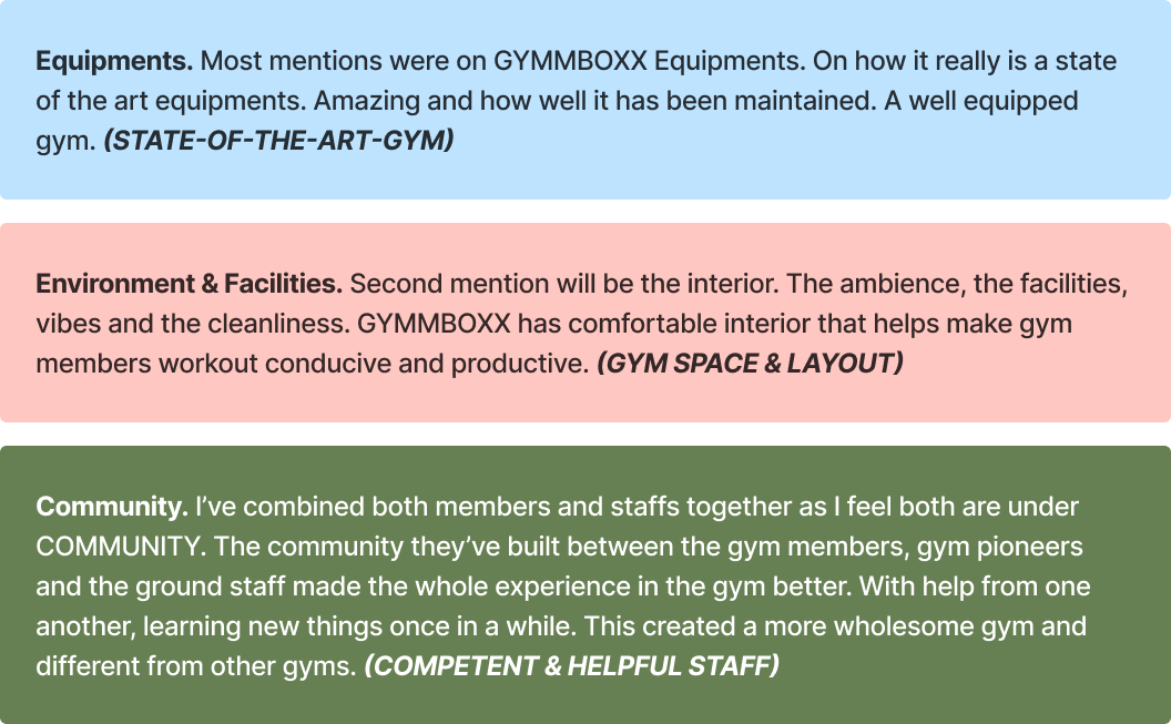
Defining the main focus of what GYMMBOXX really has to offer to members:

Top three mentioned points are the selling points of GYMMBOXX. Instead of trying to sell with promos(current website design), GYMMBOXX should showcase their facilities and equipments. Having to show what GYMMBOXX are best at would attract more attention to gym goers and new members.
DESIGN
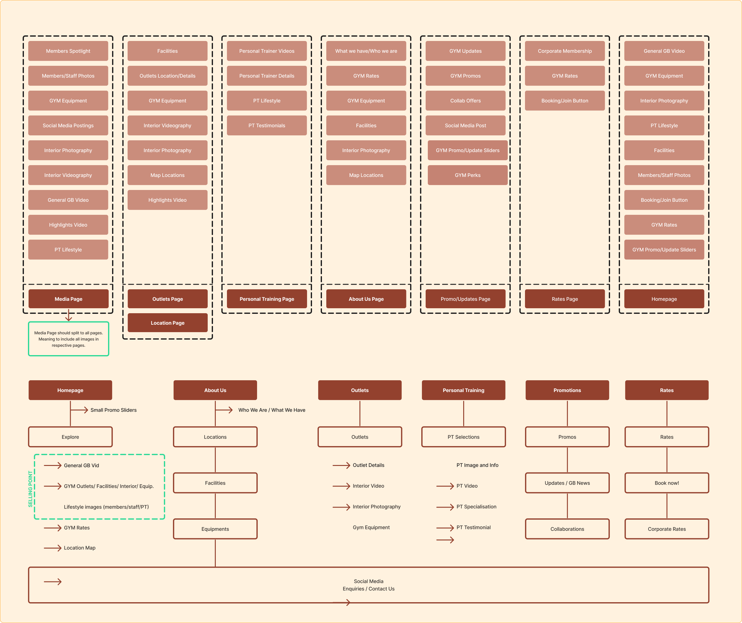
I decided to move on to the next step, Information Architect, and began with User Stories to come up with a list of key features and structuring it to have a more improved organisation and navigation.
User Stories:
- As a customer, I want to get attracted to the gym looks.
- As a customer, I want to know more about GYMMBOXX, details on every outlets and equipments owned.
- As a user, I want to be able to find out new updates on GYMMBOXX.
- As a customer, I want to know if there are any outlets located near me.
- As a customer, I want to know what services do GYMMBOXX have.
- As a user, I want to know if there are any offers or promos from GYMMBOXX.
- As a user, I want to know if there are PT who would help with my training.
- As a customer, I want to know if the Personal Trainers here are reliable and good.
- As a user, I want to see visuals and media of GYMMBOXX and it’s outlet interior.
- As a customer, I want to know if GYMMBOXX is the gym I should go for.
- As a customer, I want to know their membership rates.
- As a user, I want to see more highlights on GYMMBOXX.
- As a staff, I want customers to know who we are and that we are a gym to go for.
- As a staff, I want others to know how strong the community here is.
- As a staff, I want a Call to Action.
Features:

